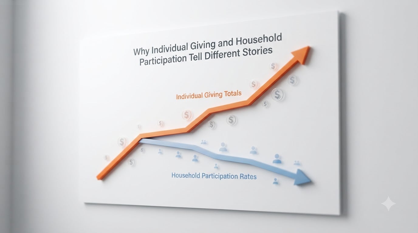
When I look at the latest charitable giving data, I see a paradox that confuses almost everyone I work with. Americans gave $592.50 billion in 2024, a 6.3% jump from the year before. Individuals contributed $392.45 billion of that total, which is 66.7% of all giving. Yet the most recent Philanthropy Panel Study data shows that under 50% of U.S. households made a charitable contribution. How can giving be at record highs while participation keeps shrinking?
The answer is that individual giving and household participation measure two different things. One tracks how much money flows into nonprofits. The other counts how many households participate at all. When I explain this to nonprofit leaders, fundraisers, and donors, the same light-bulb moment happens. These two metrics can move in opposite directions, and they often do. Understanding why is essential for anyone who wants to read philanthropy data correctly in 2026.
Table of Contents
- 1Defining Individual Giving vs Household Participation
- 2The Paradox: More Dollars, Fewer Donors
- 3How Giving USA and the Philanthropy Panel Study Measure Different Things
- 4What Gets Counted and What Gets Missed
- 5Why the Two Metrics Diverge Over Time
- 6Implications for Understanding American Philanthropy
- 7Frequently Asked Questions
- 8What percent of households give to charity?
- 9Do affluent Americans give more but fewer households donate to charity?
- 10What is the difference between philanthropy and giving?
- 11What does individual giving mean in fundraising?
- 12Conclusion: Reading Both Stories Together
Defining Individual Giving vs Household Participation
Individual giving refers to the total dollar amount donated by persons to charitable organizations. It is a sum of money, not a count of people. Household participation measures the percentage of households that report making any charitable contribution in a given year. It is a behavioral measure, not a financial one.
These two metrics answer different questions. Individual giving tells you how much fuel is in the philanthropic engine. Household participation tells you how many drivers are behind the wheel. A sector can have record fuel and fewer drivers at the same time, and that is exactly what we are seeing.
The distinction matters because each metric uses different data sources. Individual giving totals rely on IRS data combined with statistical estimates. Household participation comes from surveys like the Lilly Family School of Philanthropy’s Philanthropy Panel Study, which asks a nationally representative sample of households whether they gave. Both approaches are rigorous, but they count different parts of the giving universe.
The Paradox: More Dollars, Fewer Donors
Here is the tension that sits at the heart of modern philanthropy. Total individual giving has hit record after record in recent years. Yet the share of households that give has been declining for decades. The two narratives cannot both be the whole story, unless we understand that they tell different stories.
According to Bank of America’s Study of Philanthropy, affluent household giving participation fell from 91% to 81% over a recent multi-year period. Even among the wealthiest Americans, fewer households are giving, but those who do give are giving more. The average donation amount has climbed steadily while the number of donor households has shrunk.
For the broader population, the data tells a similar story. Less than half of U.S. households made a charitable contribution in 2018, according to the most recent PPS data. The two-thirds of households who do give money average a hefty 4 percent of their income in gift-making. The remaining one-third of the population gives nothing at all. This concentration of giving inside a smaller pool of donors is the central pattern behind the divergence.
How Giving USA and the Philanthropy Panel Study Measure Different Things
To understand why the two metrics diverge, you have to understand how each one is built. Giving USA, the annual report published by the Giving USA Foundation, calculates the individual giving total by combining itemized deduction data with estimates for non-itemizing households. The IRS provides the foundation, and statisticians model the rest.
The Philanthropy Panel Study takes a different approach. It surveys the same households over multiple years and asks whether they made charitable contributions, how much, and to whom. This longitudinal design captures behavior that tax data can miss, especially among households that do not itemize. It also picks up informal giving and religious donations that flow outside the formal 501(c)(3) sector.
When I run these two methodologies side by side, gaps appear. Itemized vs non-itemized returns create visibility differences. A household giving $500 to a local food bank may show up in PPS data but contribute nothing to the IRS-derived Giving USA estimate if they take the standard deduction. Multiply that gap across millions of households, and the totals start to diverge in measurable ways.
What Gets Counted and What Gets Missed
Neither metric captures the full picture of American generosity. Giving USA focuses on formal contributions to 501(c)(3) organizations and a few related categories. It is the gold standard for tracking dollars flowing to registered charities, but it leaves out informal giving entirely.
Informal giving includes person-to-person help, GoFundMe campaigns, mutual aid networks, religious offerings outside formal institutions, and direct support to neighbors in need. None of this shows up in IRS data, and most of it does not appear in survey totals either. The Lilly Family School estimates that informal giving adds up to billions of dollars that the formal sector never counts.
Crowdfunding sits in an awkward middle ground. Some platforms route donations to registered 501(c)(3) recipients, which counts. Other campaigns go directly to individuals, which does not. As crowdfunding has grown, the gap between formal and informal giving has widened, and our measurement tools have not kept pace. Donors of color, in particular, often give through informal channels that traditional philanthropy metrics systematically miss.
Why the Two Metrics Diverge Over Time
Several structural forces push individual giving and household participation in opposite directions. The first is wealth concentration. When the top 10% of households hold a growing share of national wealth, large donations from that group can drive total dollars up even when participation rates fall. A single eight-figure gift can move the national total more than thousands of small donations combined.
The second force is generational change. Younger generations give differently than their parents and grandparents. They are more likely to give through crowdfunding, recurring small donations, and direct response campaigns. They give less through traditional mail appeals and year-end checks. These patterns shift the composition of donors without always changing the total dollars.
The third force is tax policy. Changes in the standard deduction, especially after the 2017 Tax Cuts and Jobs Act, dramatically reduced the number of households that itemize. As itemization rates dropped, the IRS data became a less complete picture of household giving. The Philanthropy Panel Study, which does not rely on tax records, captured trends that the tax data could no longer see.
The fourth force is digital giving. Online donation platforms, text-to-give campaigns, and embedded checkout flows have made it easier to give small amounts more frequently. This expands the donor pool in some ways and fragments it in others. Tracking who gives, to whom, and through which channel has become genuinely harder.
Implications for Understanding American Philanthropy
Reading either metric alone is misleading. When I see headlines celebrating new records in total giving, I always ask: at what participation rate? When I see alarming statistics about shrinking donor bases, I always ask: what is happening to the dollars? Only by combining both views can we understand the true health of the sector.
For nonprofit professionals, this dual view has practical consequences. Major gift fundraising drives totals, but broad-based participation sustains civic infrastructure, volunteer pipelines, and political legitimacy. A nonprofit that grows its major gifts while losing its base donors is building on a narrowing foundation. Conversely, a nonprofit that maintains broad participation but ignores major gifts leaves significant resources on the table.
For researchers and policymakers, the divergence raises serious questions. If giving is concentrating among fewer households, what does that mean for democratic accountability? If informal giving is growing faster than formal giving, how should we measure civic generosity? These are questions the existing data infrastructure was not designed to answer.
Frequently Asked Questions
What percent of households give to charity?
Under 50% of U.S. households made a charitable contribution in 2018, according to the most recent Philanthropy Panel Study data. Among households that do give, the average contribution is roughly 4 percent of household income. The remaining one-third of American households give nothing in a typical year.
Do affluent Americans give more but fewer households donate to charity?
Yes. Bank of America’s Study of Philanthropy found that affluent household giving participation fell from 91% to 81% over a recent multi-year period. Even among wealthy households, fewer are giving, but those who do give are giving larger amounts on average. Total individual giving continues to rise even as the share of donor households declines.
What is the difference between philanthropy and giving?
Giving refers to any transfer of money or resources to others, including informal acts like helping a neighbor or donating through crowdfunding. Philanthropy is a broader concept that typically refers to organized, voluntary efforts to promote human welfare, often through formal institutions and strategic goals. Individual giving is one component of overall philanthropic activity.
What does individual giving mean in fundraising?
Individual giving refers to charitable contributions made by persons, as opposed to gifts from corporations, foundations, or bequests. It is the largest source of charitable giving in the United States, representing 66.7% of all contributions in 2024, or $392.45 billion. Individual giving includes donations of any size, from small recurring gifts to transformational major gifts.
Conclusion: Reading Both Stories Together
Individual giving and household participation are both accurate, neither is complete. One measures the dollars flowing into the charitable sector. The other measures how many households participate in giving at all. When I read the data together, I see a sector with growing resources but a shrinking base of supporters. That tension is the real story of American philanthropy in 2026, and anyone who wants to understand the field has to learn to read both metrics at once.